Today, I’m going to talk about incorporating neutrals in vintage home design. Neutrals have quickly become one of my favorites in home decor. It’s a classic look that you can enjoy for years to come. When decorating with vintage neutrals, I often choose the bigger, more expensive items and incorporate small pops of color using pillows, greenery and small decor accents. In our master bedroom, we have used several neutral pallets such as, creams, grays and taupes. My “go-to” colors to add with these are typically in the blue family. Hues of gray blues, gray greens and navy, just to name a few. I love the combination together!
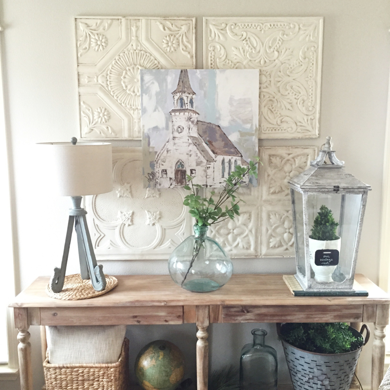
Here’s an example of a huge accent wall in our living room. Using large 24×24 inch ceiling tiles, I’ve created a focal point that has become a head turner! These tiles have received much attention on Instagram; so I thought I’d take a minute and share a little story about them. They were originally four different colors when I purchased them over ten year ago at Kirkland’s… Green, brown, yellow and red were the colors I decorated with many years ago. I’m sure many of you can relate! :) Knowing these would cover a large space, I didn’t want to get rid of them, so I painted, glazed and distressed them an antique white. Many of my friends had purchased these same tiles; once I shared that I had altered mine, they soon followed my lead. It was the best and most fun DIY and I continue to love and use them years later. They make such an impact in any space and are a perfect example of classic neutral decor.
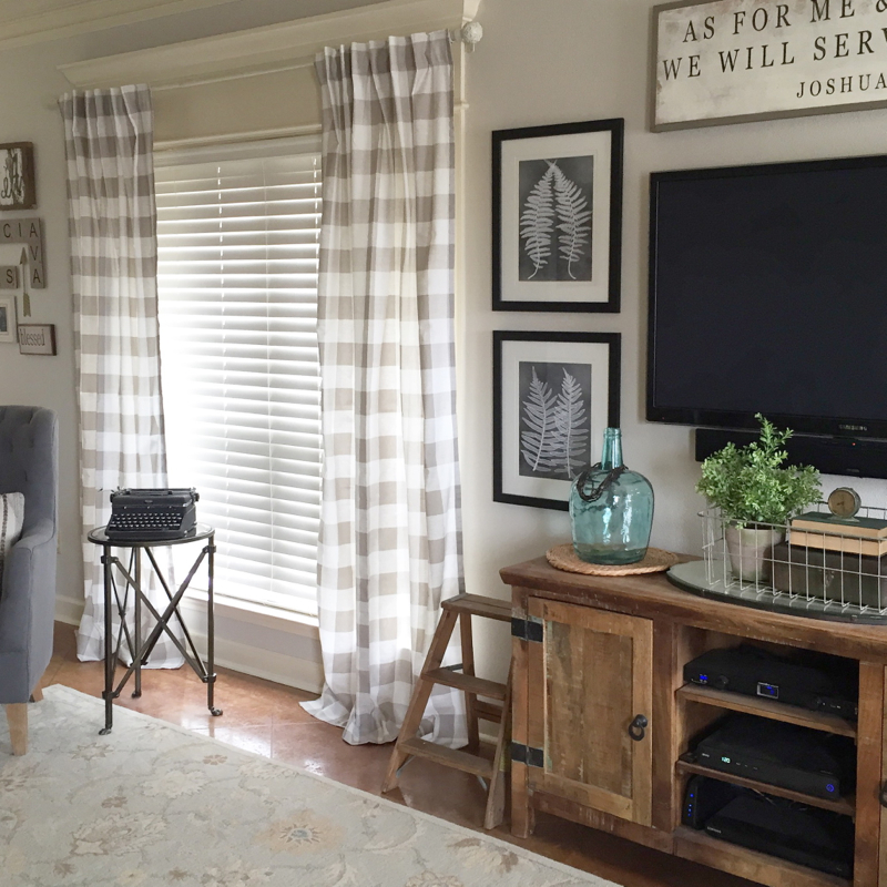
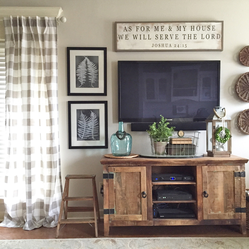
Another great way to add neutrals into a room is with fabrics! I love the look these buffalo check curtains bring to our living room. They were just what this room needed! With the neutral gallery wall in the background and design pieces around our entertainment area, they help to tie everything together!
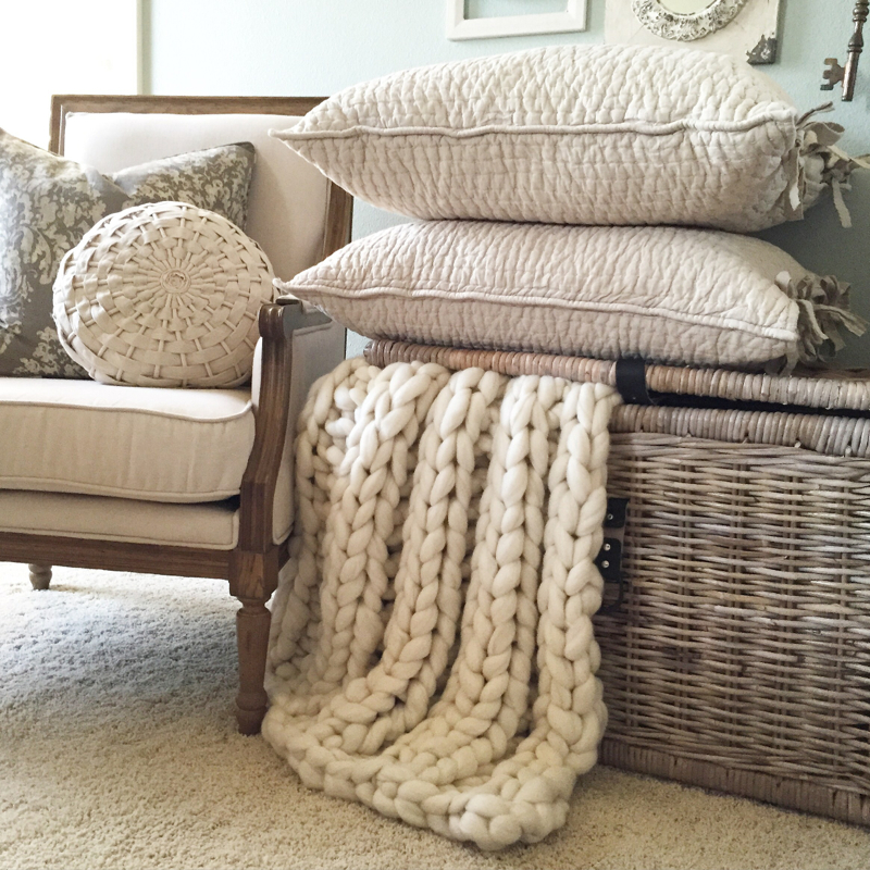
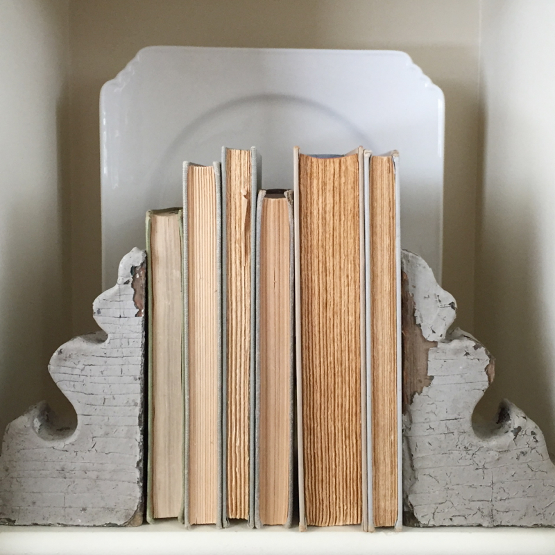
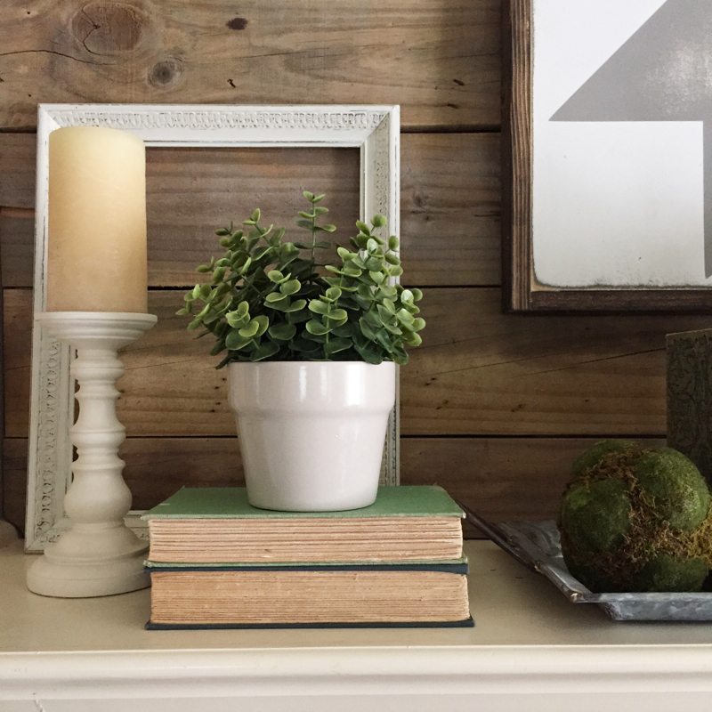
Here are a few examples of neutral vignettes I’ve created in my home…
With a few old books, chippy corbels and greenery, it doesn’t take much to create a beautiful neutral display.
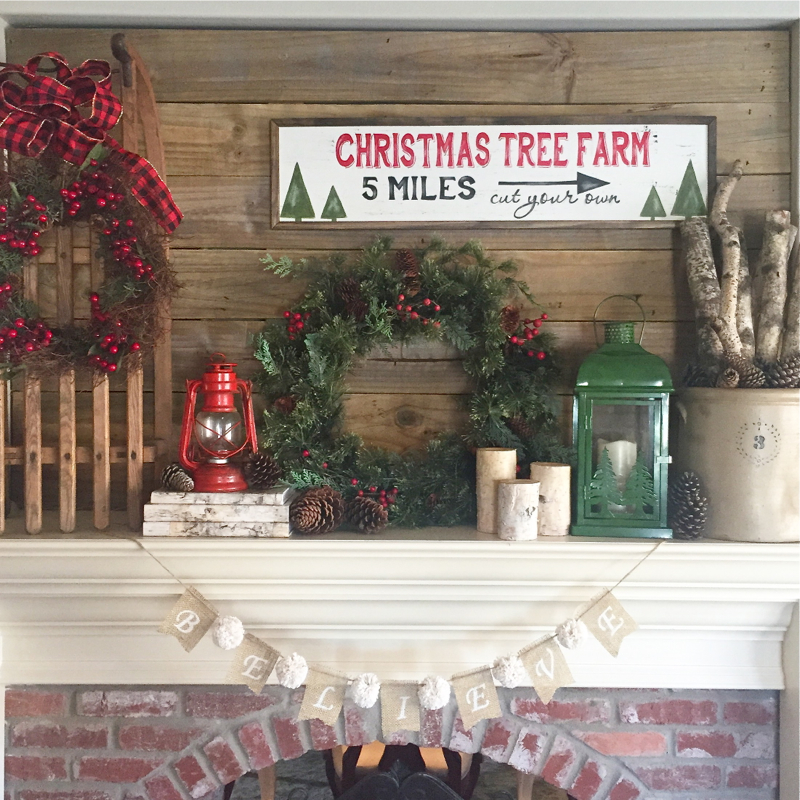
Wood is another fun neutral element that I enjoy using in my home design. This pallet wall above our two-sided mantel was a fun project that my husband and I created in our living room. A neighbor friend helped me rescue an old fence, hubby power washed the wood and cut the planks to create a fun accent wall. We anchored it in place and I was in love… Especially with the gorgeous gray tones of the wood.
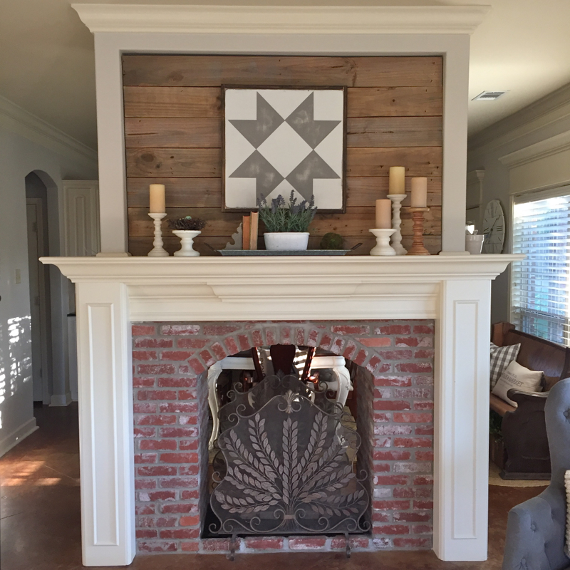
This is what it looks like most days, but during the holidays, it creates a rustic and vintage look that I adore!
If you’re looking to bring lighter colors into your home, I hope these ideas I’ve shared inspire you to incorporate neutrals in vintage home design.
Blessings,
What a fun read! I love all your tips and I love all these spaces in your home, plus your making me excited for Christmas with that darling mantle!
Thanks, friend! I’m surprisingly ready for cooler temps and decorating for Christmas! Gee, I wonder why? :) I just love what you’re doing to your new home too! Miss you!
What is the name of your bathroom tile?
Hi Lisa… Can you be more specific with which bathroom tile you’re referring to? I believe I have them all sourced in my blog post. Thanks!
Hello, I’m trying to track down where the jute rug under your kitchen table is from. Love your Instagram page! Such a gorgeous home you’ve made.
Hi Stacy… It’s from Pottery Barn, I believe they still carry it, but it has not held up well over the last few years. I honestly wouldn’t recommend it.
What paint did you use on the wall? Thanks!!
Hi Kim… I have an “Our Vintage Nest Wall Colors” blog post that shares all the paint colors. Thanks for your interest!
What did you use to paint, glaze and how do you distress the tiles? I have three yellowishish ones from
Pottery Parn that I’m wanting to do the same thing. Would love to hear your way of doing this…
Thank
You!
Hi Laura Beth – I bought mine at Kirkland’s 10+ years ago. They were four different colors… Green, yellow, brown and red. I used an interior latex paint; I believe Dover White was the color. It took 3-4 coats, then I glazed them with a Ralph Lauren glaze (I don’t recall the color, but believe it’s discontinued) and distressed the edges with a 220 grit sandpaper. Hope that helps and thanks for your interest!